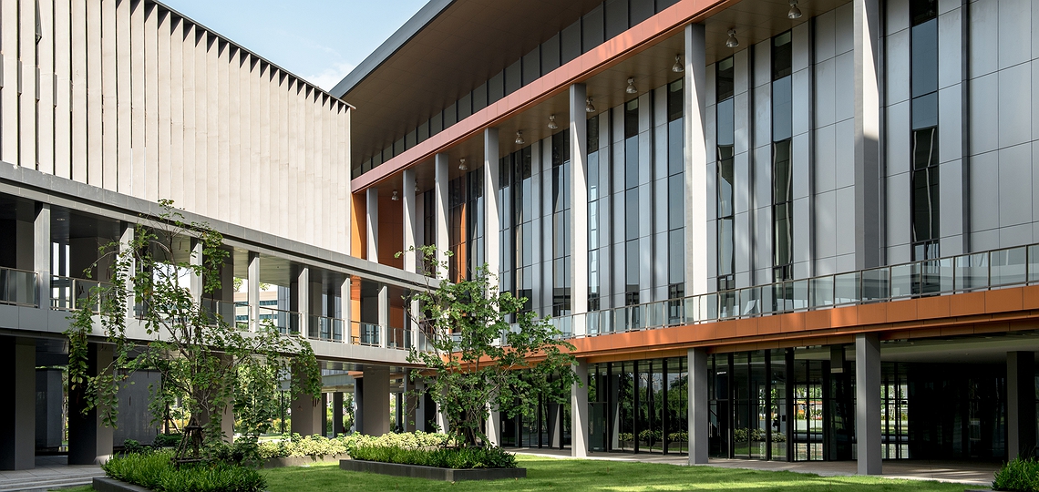
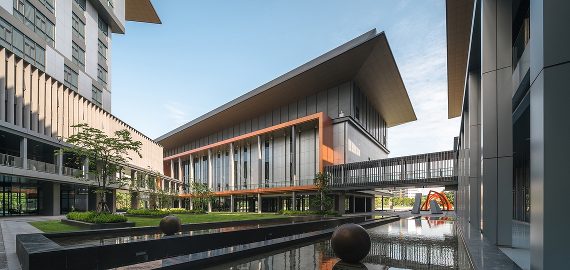
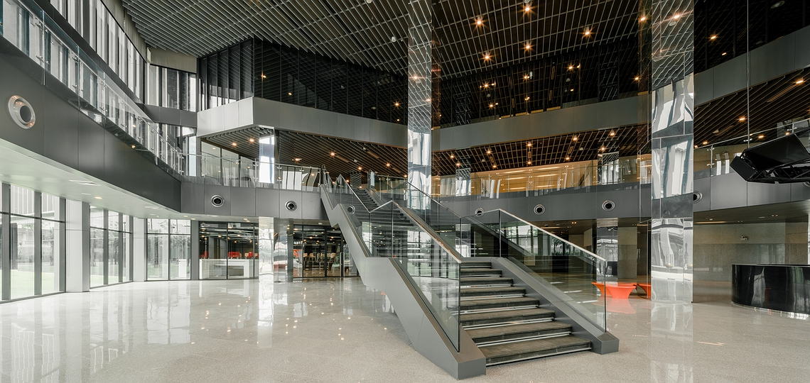
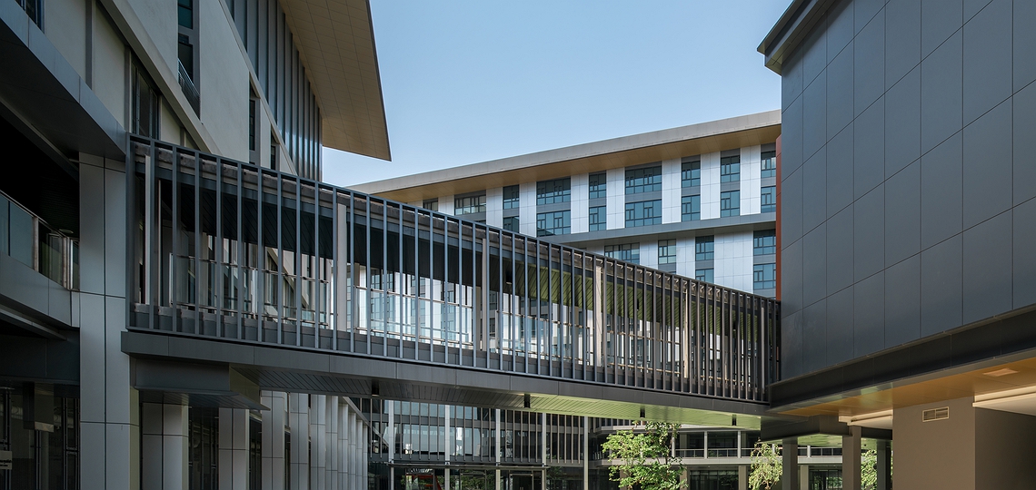
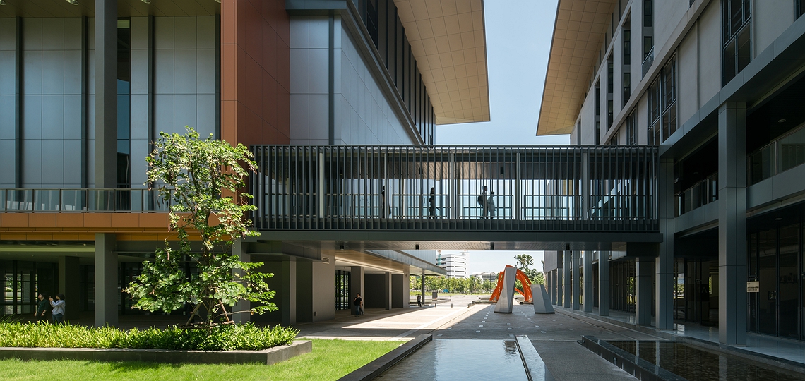
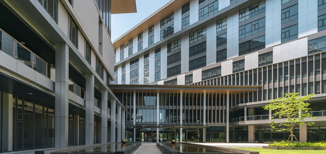
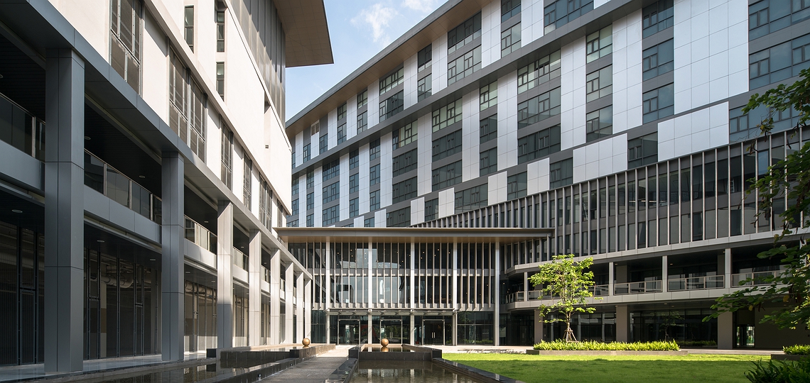
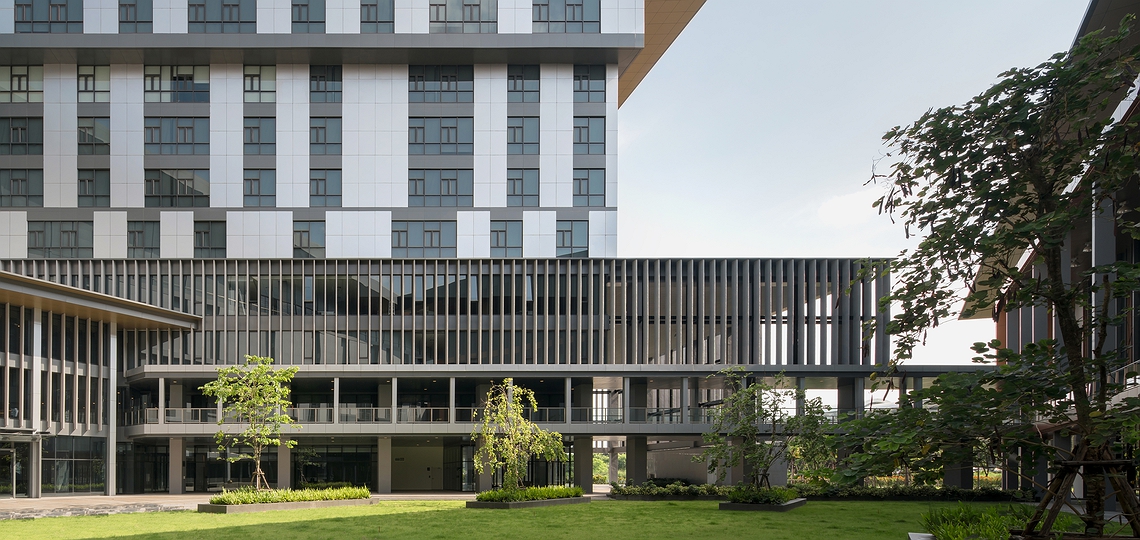
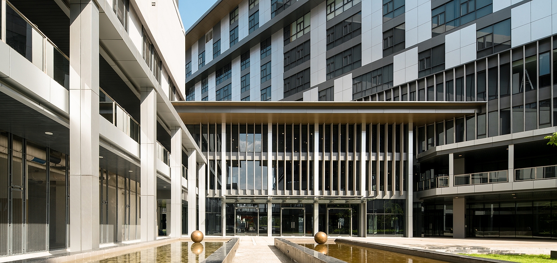
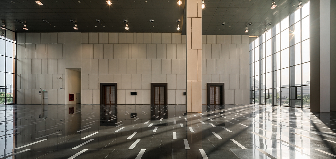
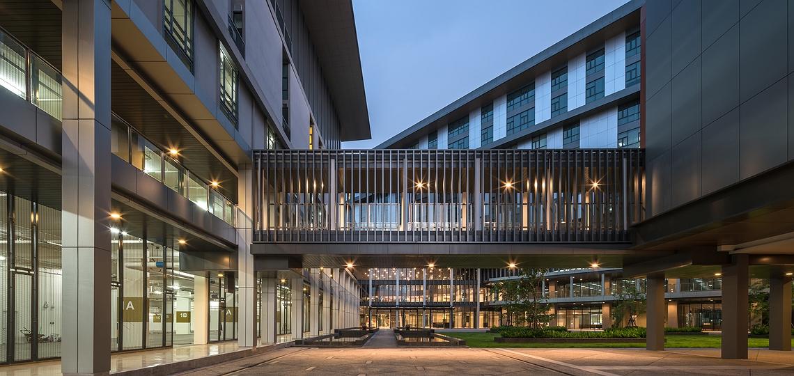
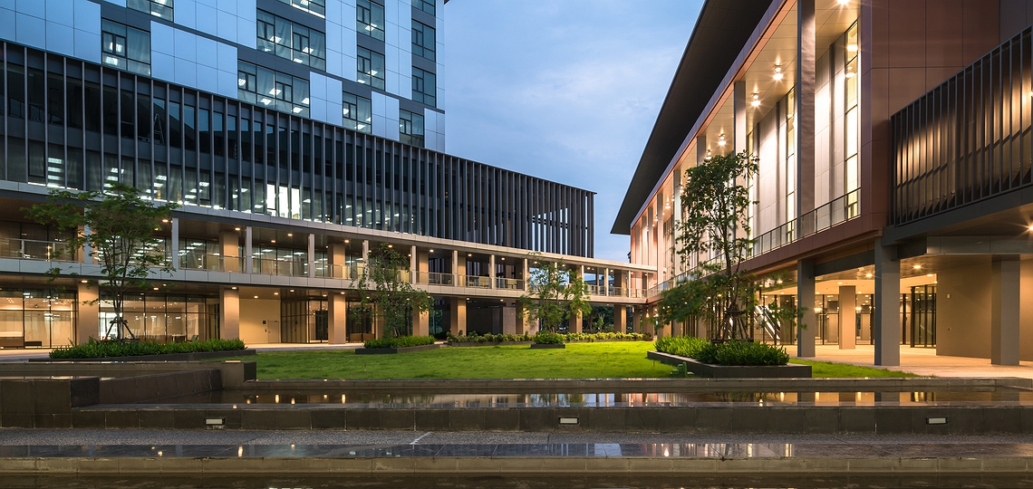
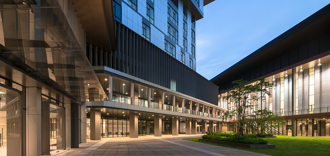
The building layout is divided into 3 functional area; the offices, auditorium, and parking with a center green common space connecting the difference areas together. The green space between buildings can block sun light radiating into the building, maximizing the use of natural light in the space. Some area of the green common space can be used as an extra outdoor parking.
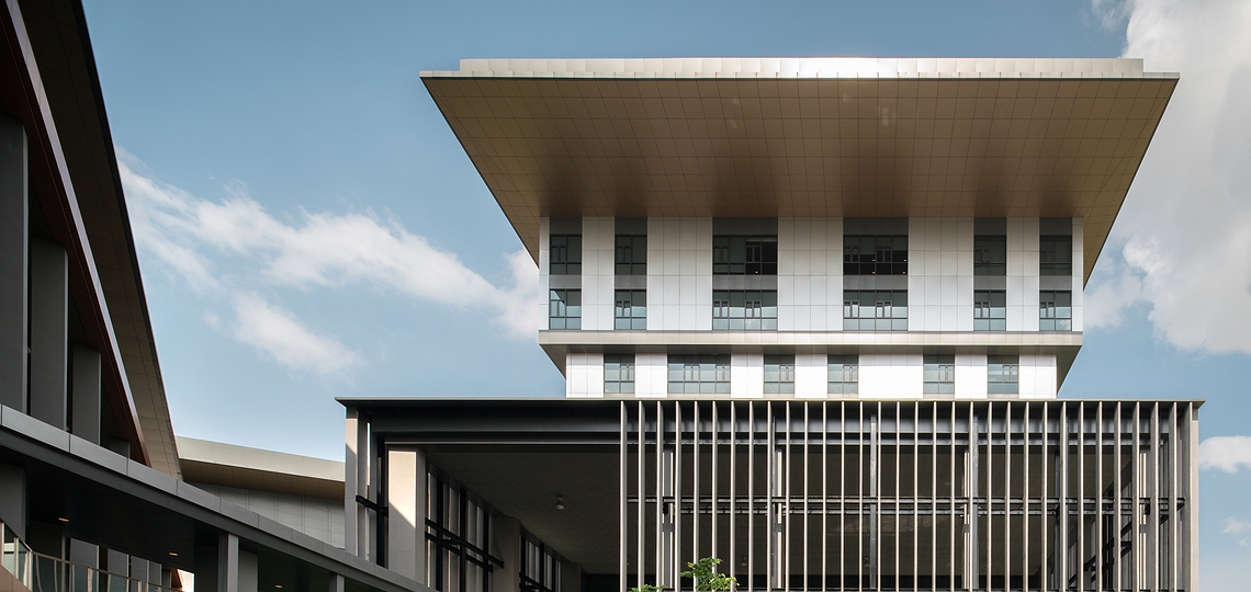
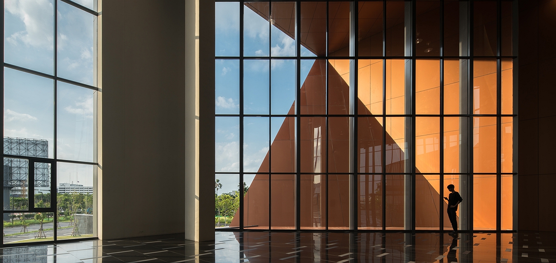
The idea of the building layout is to have an auditorium as the front-face of the building for the use of public section. The gymnasium and fitness center are on top of the parking building to minimize the building footprint. The office building is placed in a proper orientation so it creates a good working environment. The roof of the buildings is designed by conceptually link the roofs together, creating a continuous rising roof shape in the process. The rising continuous represent the growing development of the company.
Winning Design Competition 2012
